Designing a Colorful Kitchen That Feels Bold Bright and Balanced
We love kitchens that make a statement without shouting, where vivid color and thoughtful calm coexist. When done right, bold hues can energize morning routines, bright tones can lift the mood, and a balanced approach keeps the space feeling intentional instead of chaotic. We want color to feel like good design rather than a gamble, so we focus on harmony, contrast, and smart anchoring to build rooms that are as livable as they are eye-catching.
Throughout this piece we’ll walk through how to choose a color palette that sings together, anchor it with neutrals and grounding tones, and make confident choices for cabinets, backsplashes, countertops, and appliances. We’ll explore lighting and finishes that enhance hues, textures and materials that add depth, and styling tricks with textiles and greenery that bring the whole look to life—all while keeping layout, flow, and durability top of mind so your colorful kitchen not only looks amazing but works beautifully every day.
The Philosophy of Bold, Bright, Balanced Kitchens
You treat color like a voice in your kitchen, not a scream. Pick a primary hue that reflects how you want to feel in the space, add one or two brighter notes for personality, and let neutrals or warm wood tones ground the look so the bold choices read as confident, not chaotic. Pay attention to natural and artificial light because the same paint can feel playful at noon and intense at dusk.
Balance comes from how much color you use and where you place it. Use repetition to create rhythm, scale to control intensity, and texture to soften saturated surfaces—glossy cabinets pop, matte tiles calm. Test swatches, live with samples, and let function guide flair so your kitchen stays joyful and practical.
Choosing Your Color Palette: Harmonies and Contrasts
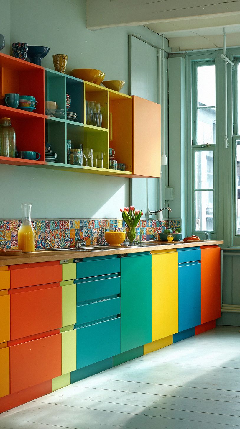
Start by picking a dominant hue that sets the mood you want, then choose supporting colors using simple color wheel rules: analogous shades for a warm, layered look, complementary tones for punchy contrast, or a triadic scheme for playful balance. Keep one color as the star on cabinets or walls, and let the others play supporting roles in backsplashes, textiles, and accessories.
Temper bright pigments with neutrals and varied finishes so the room feels lively but not chaotic, and use small accent doses to make color feel intentional rather than overwhelming. Test swatches in different light, try paint on poster board to move around the room, and mix matte, glossy, and textured elements to keep the palette dynamic and balanced.
Anchoring the Space with Neutrals and Grounding Tones
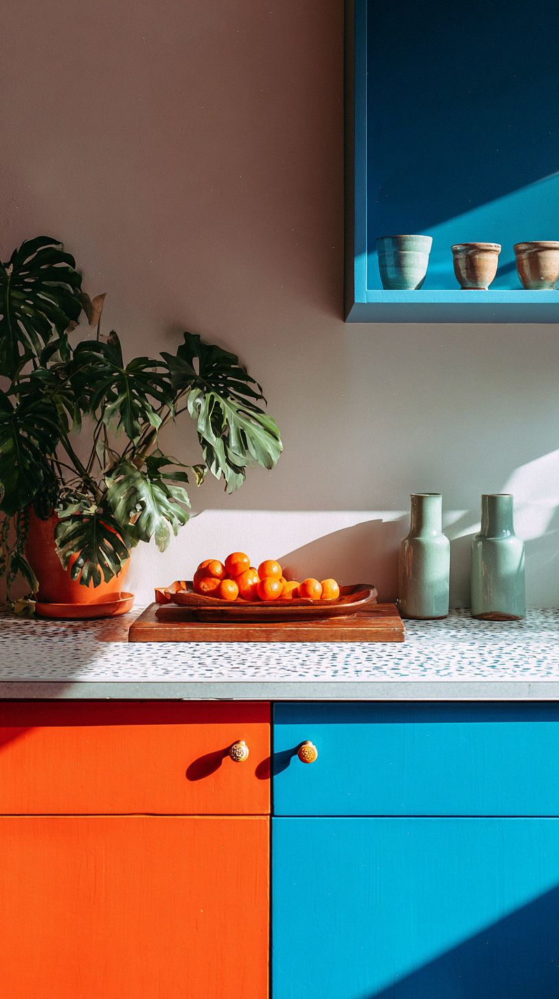
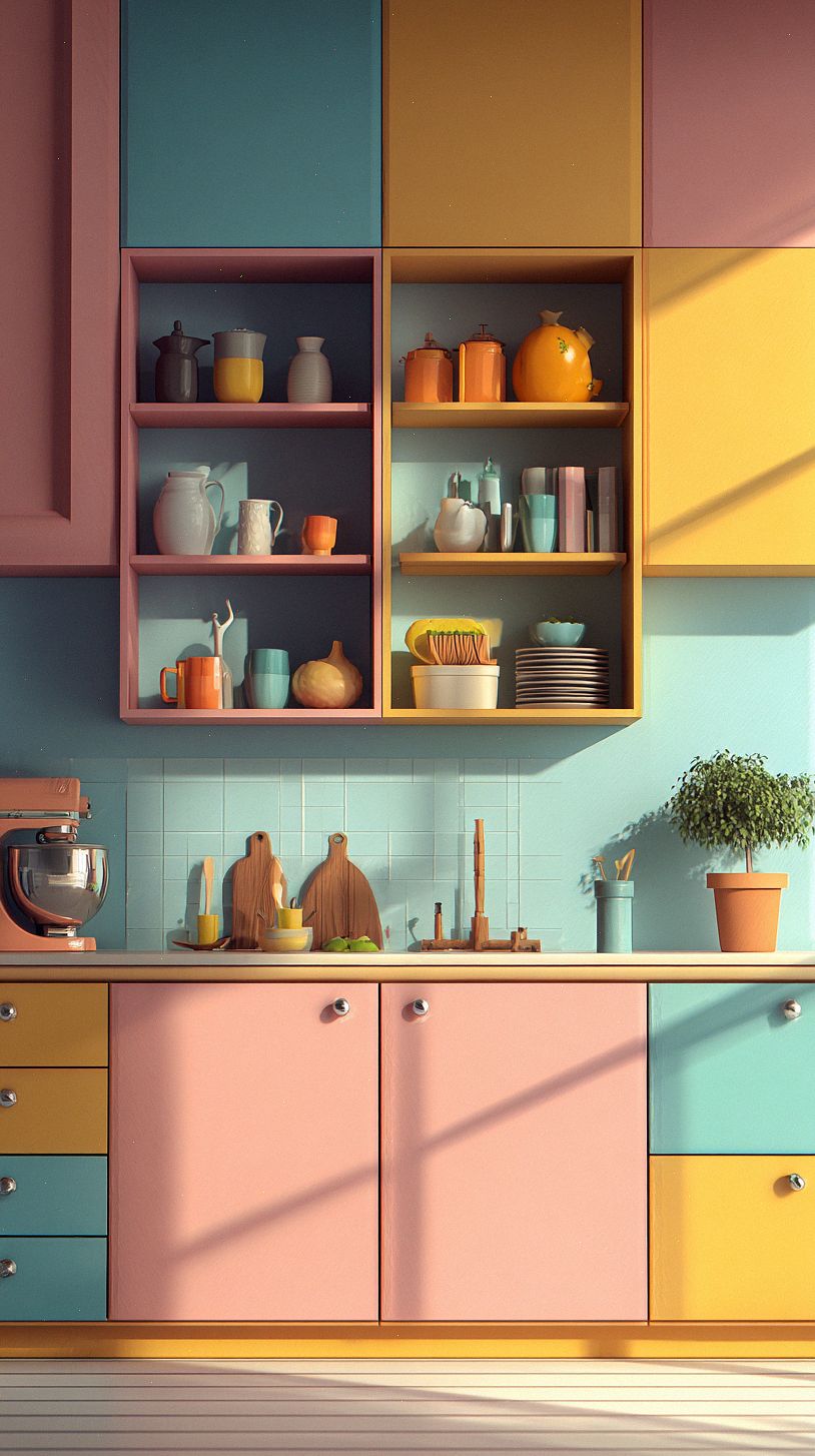
Treat neutrals like your canvas: soft whites, warm beiges, or cool grays give your bright accents somewhere to land so they read bold instead of chaotic. Put those tones on large planes—walls, floors, or upper cabinets—so the eye rests and your colorful choices feel intentional.
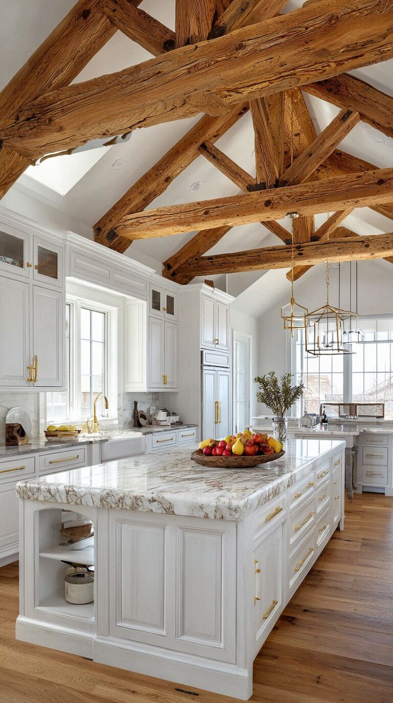
Introduce grounding tones on lower cabinets, an island, or in natural materials like wood and stone to add weight without dulling the palette. Repeat those grounding hues in small details—trim, hardware, or a countertop edge—and use textured finishes to create depth so your bright colors pop in a balanced, confident way.
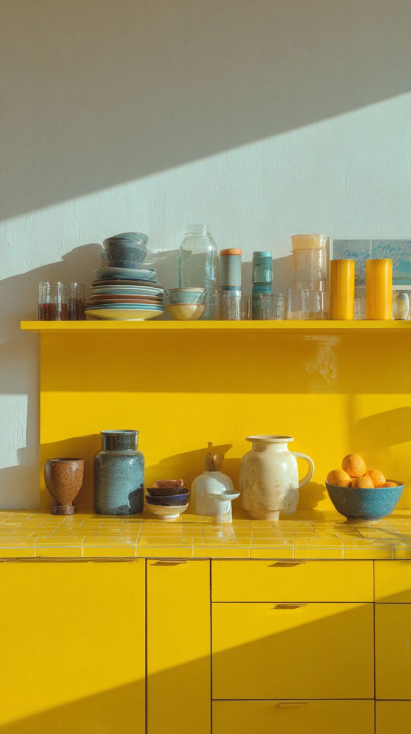
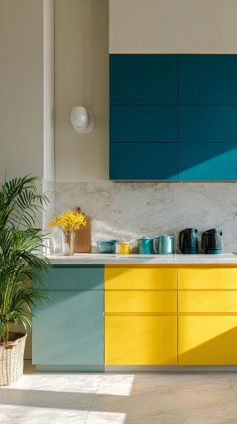
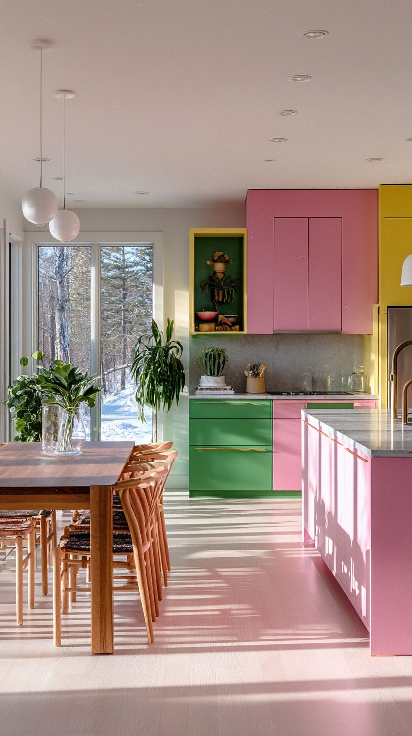
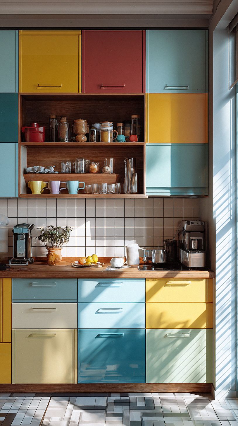
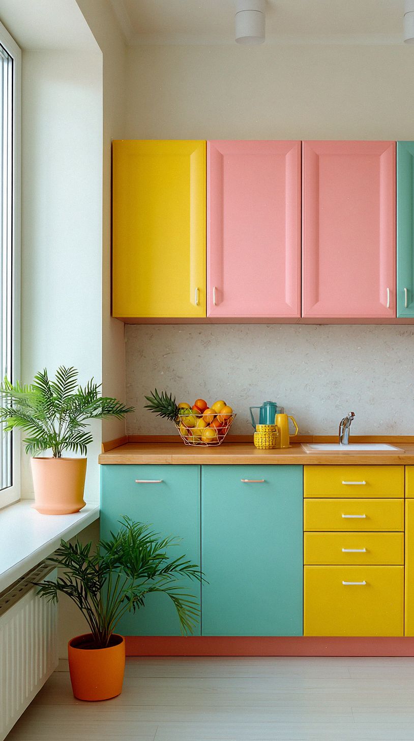
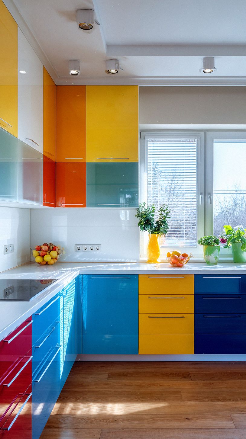
Making a Statement with Cabinets and Appliances
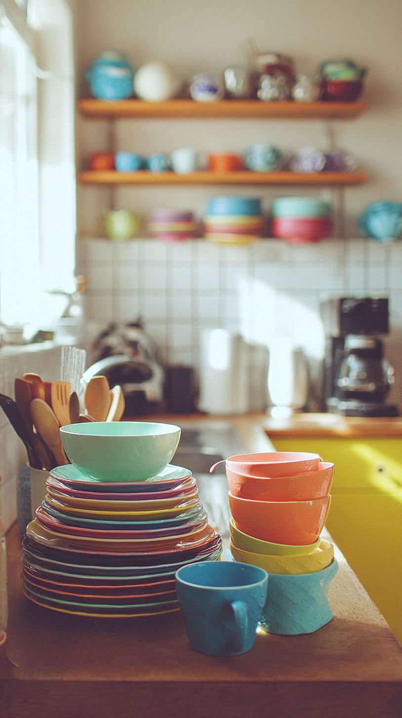
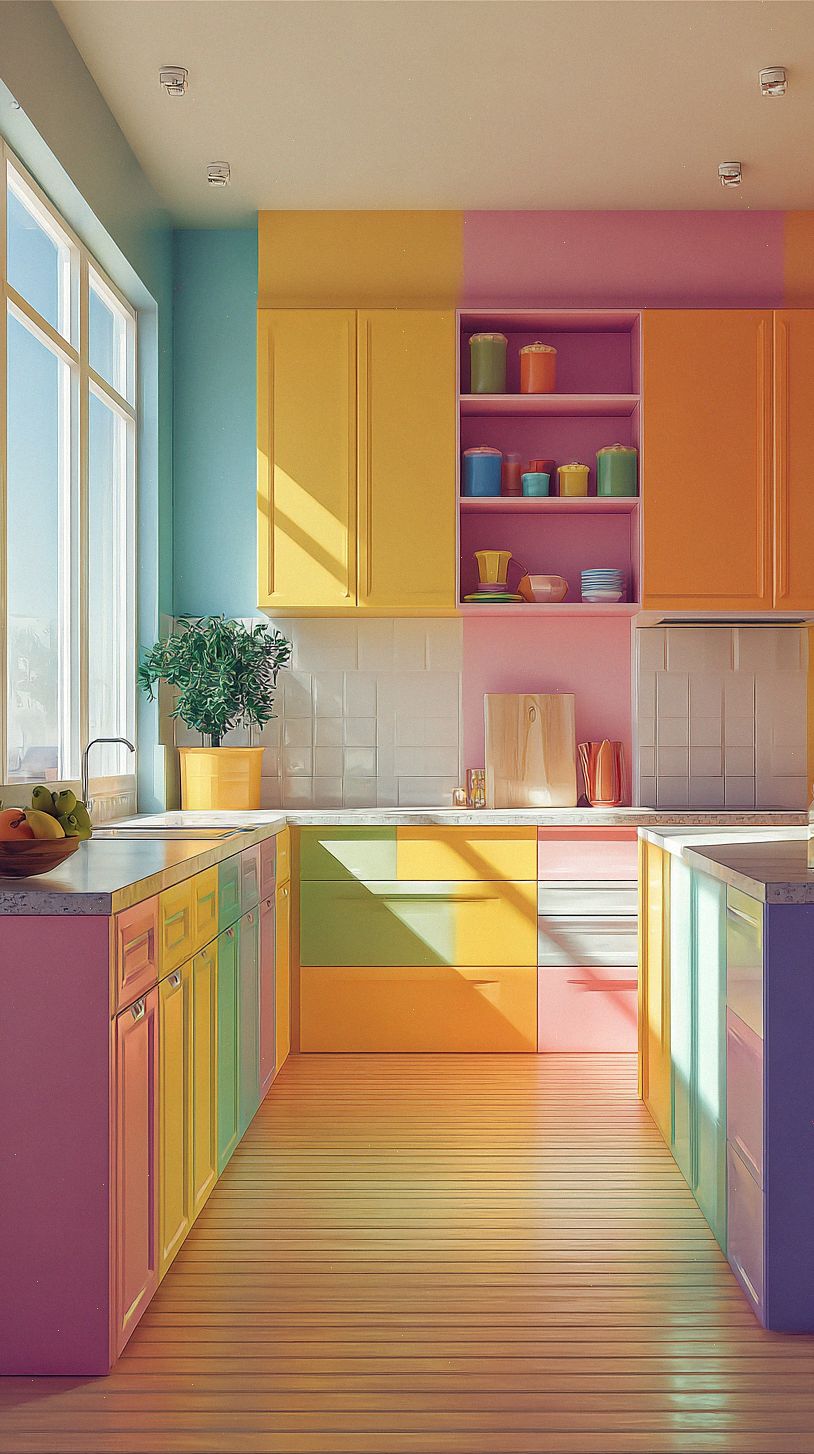
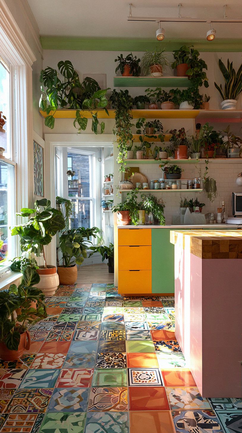
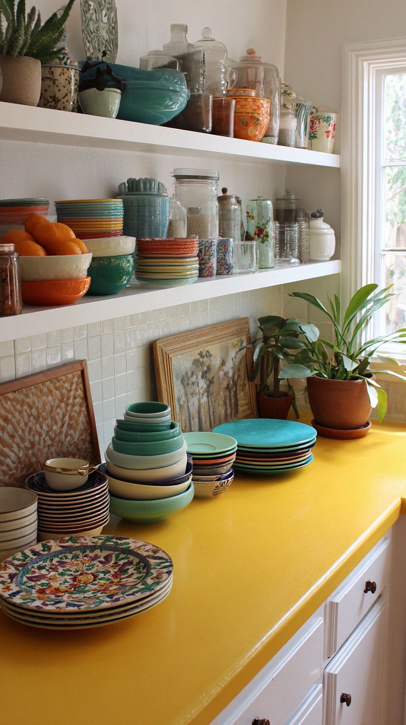
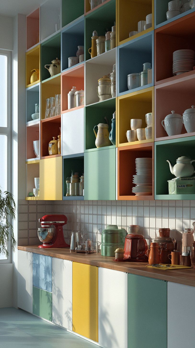
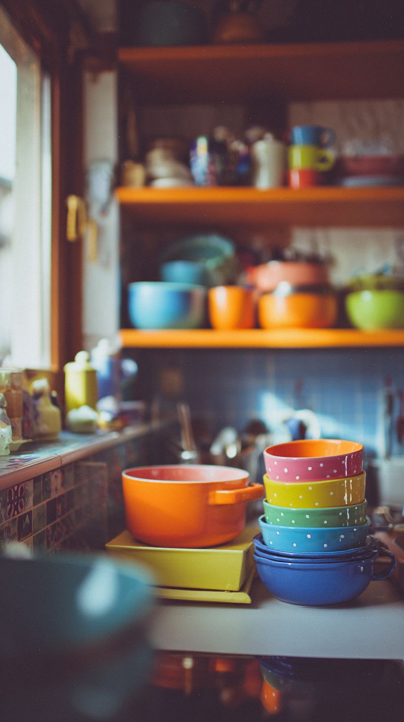
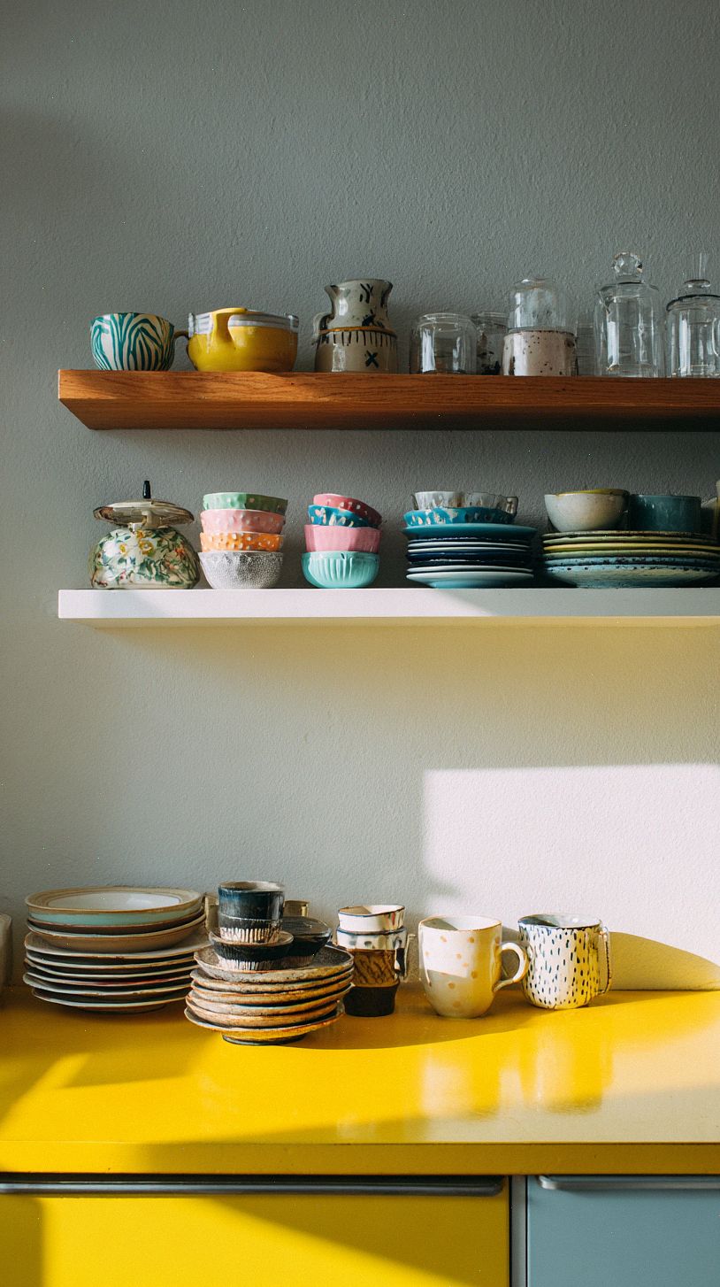
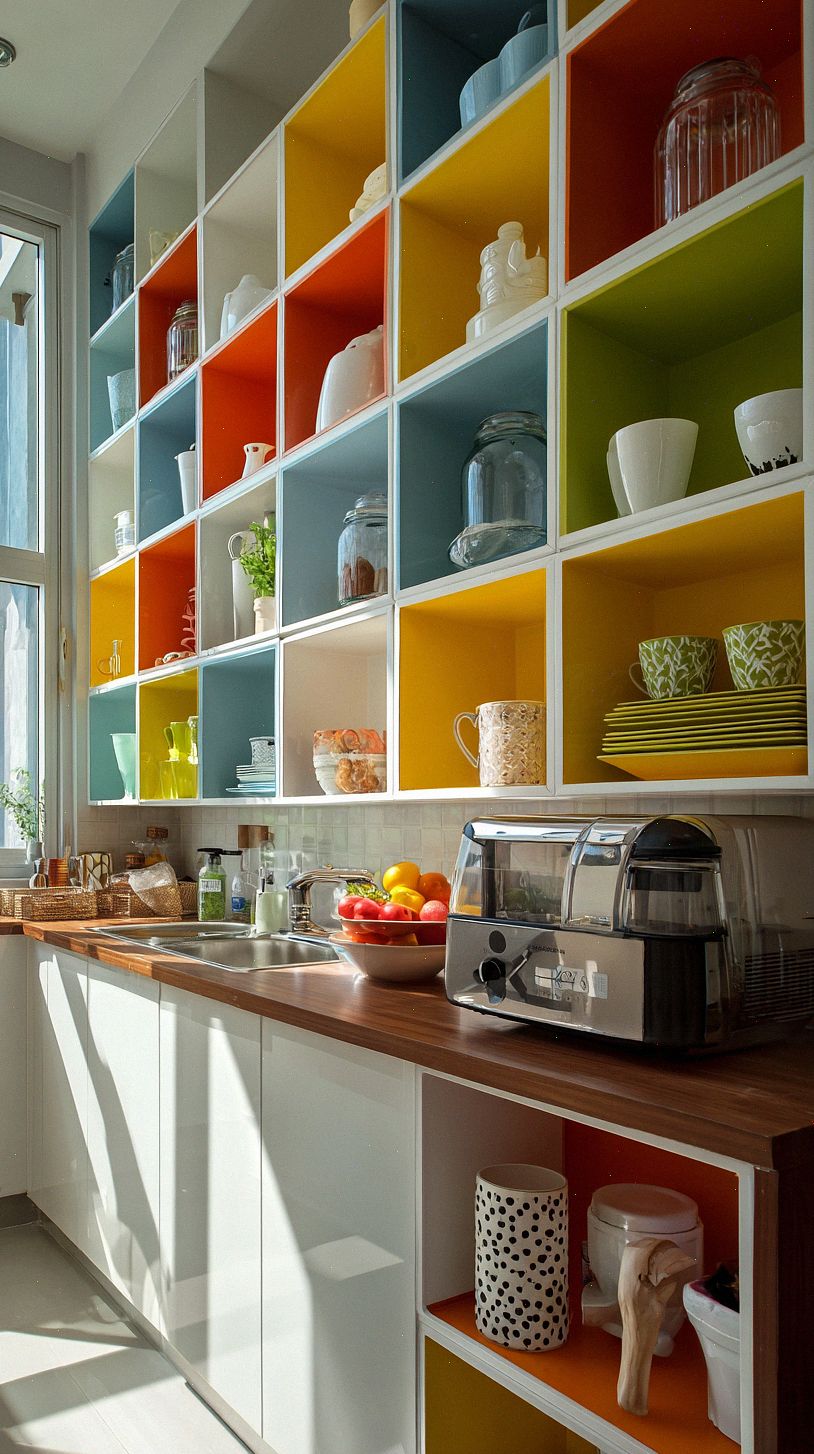
Choose cabinetry that feels like jewelry for the room, whether you go deep jewel tones on the island and softer hues on upper cabinets or pick a single saturated color for all drawers to create drama. You can balance bold paint by mixing finishes, like matte lower cabinets with glossy uppers, swapping in brass or black pulls, or leaving a section of open shelving to break the color and showcase dishes.
Appliances are your second focal point, so decide if you want them to blend or shout. Panel-ready fridges and dishwashers make a strong color pop feel intentional, while a colorful range or retro refrigerator becomes the playful anchor; pair those choices with neutral counters and backsplashes so the eye rests and the space still feels balanced.
Colorful Backsplashes and Tile Patterns
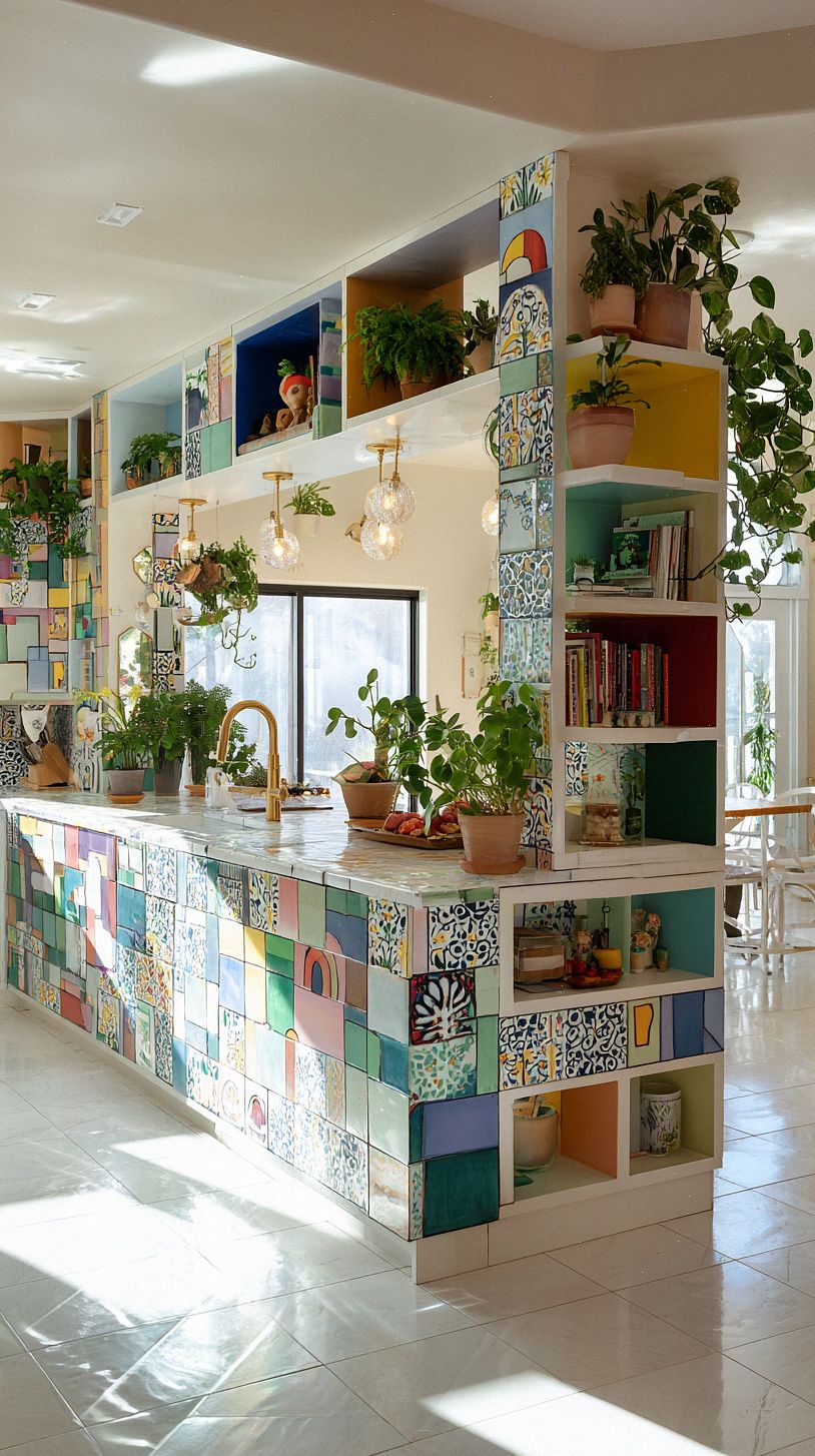
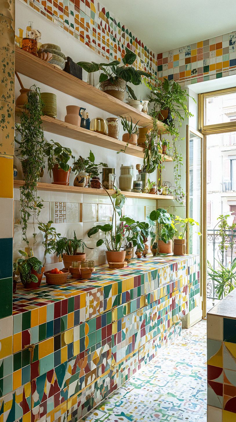
Make your backsplash the personality piece of the room by choosing a bold color or playful pattern that draws the eye. You can go all-in with a floor-to-ceiling splash behind the range, create an ombre row of tiles for movement, or pick a geometric layout like herringbone or Moroccan zellige to add texture without overwhelming the space.
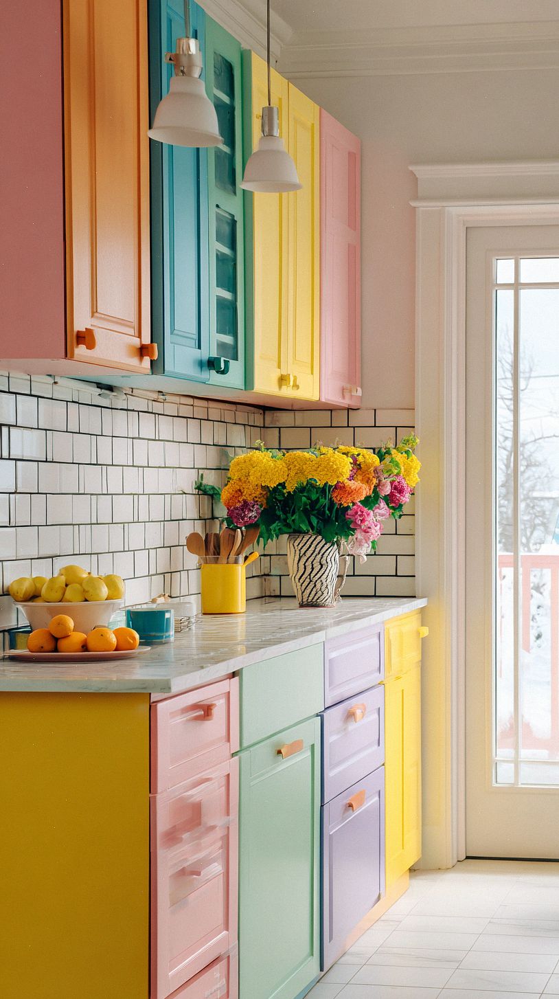
Keep the rest of your palette calm so the tile feels intentional rather than chaotic, and echo the backsplash color in small touches like dishware, bar stools, or a pendant light to create cohesion. Pick durable, easy-clean materials like glazed ceramic or porcelain and experiment with grout color to either sharpen the pattern or soften it for a more subtle effect.
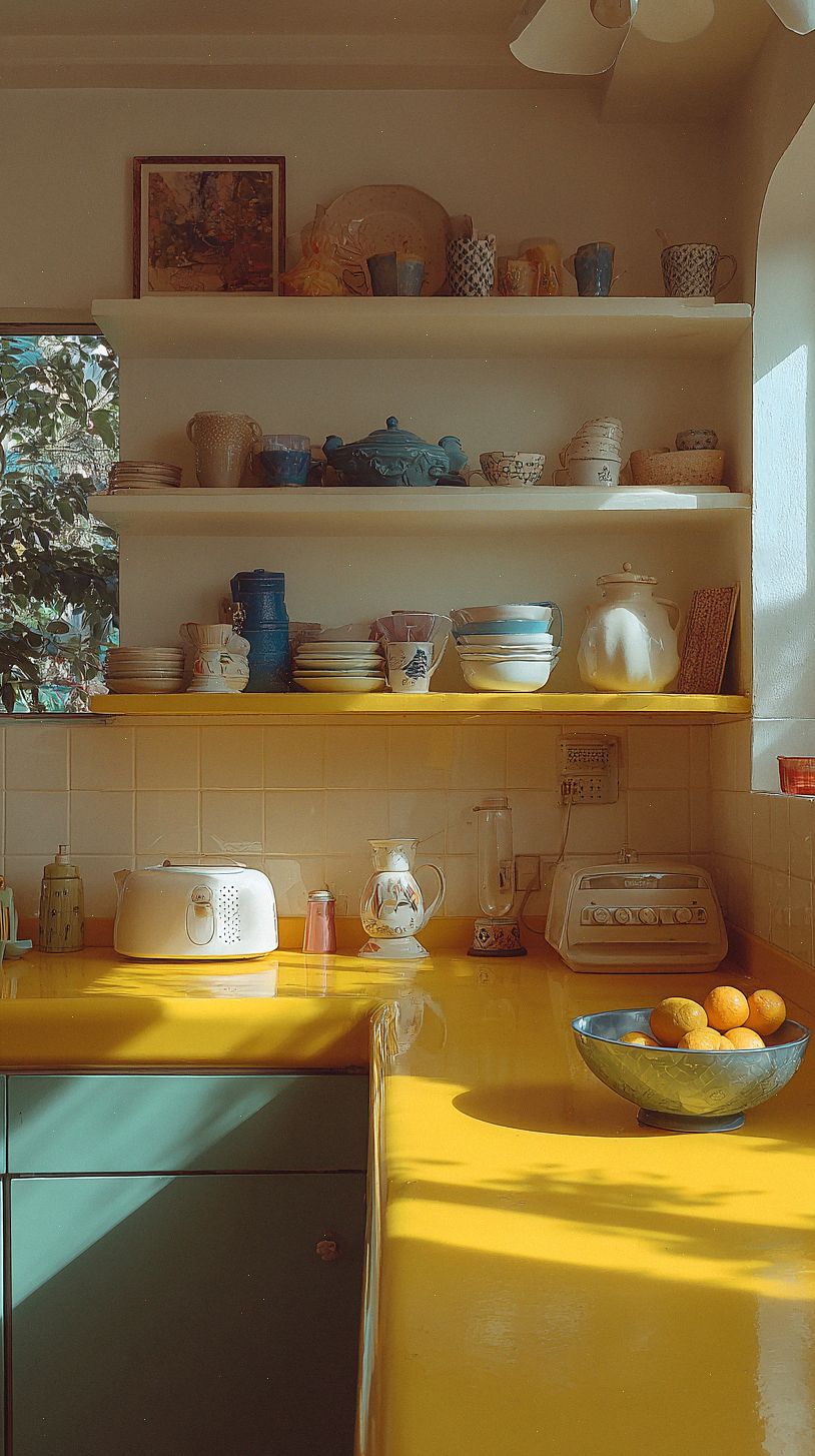
Countertops and Surfaces That Complement Color
When you’re working with bold color, countertops are one of the easiest ways to keep the look feeling balanced instead of chaotic. A soft veined quartz or marble with undertones that match your palette can calm a bright cabinet color, while warm butcher block brings a cozy counterpoint to cool, saturated hues. If you want modern contrast, go for honed concrete or dark soapstone to anchor the room.
Think of backsplashes, hardware, and edge profiles as finishing notes that can either echo or play off your countertop choice. Try samples in the actual kitchen light before committing, pay attention to grout and seam placement, and don’t be afraid to introduce a small pop of the cabinet color in a strip of tile or a colored edge for cohesion.
Lighting Strategies to Enhance Hue and Mood
Think in layers: combine bright overhead ambient light with targeted task lighting over prep zones and soft accent lights to highlight a colorful backsplash or open shelving. Under-cabinet LEDs keep countertops shadow free, pendant lights add personality above an island, and a dimmer lets you shift the vibe from energizing morning to cozy evening. Choose bulbs with a high CRI so colors read true, and place fixtures to avoid casting your own shadow while you cook.
Play with color temperature to tweak mood and hue, using cooler light for crisp blues and greens and warmer tones to amplify reds, oranges, and wood finishes. Consider tunable white or smart bulbs so you can change warmth throughout the day, and use directional spots or strip lighting to make glossy tiles or metallic accents sing without creating glare.
Textures, Materials, and Finish Pairings
Textures are your secret balancing tool. Pair glossy backsplashes with matte cabinets so color stays vivid without feeling loud, and add warm wood or honed stone countertops to introduce a calming, tactile contrast that softens bright hues.
Finishes act like punctuation in your scheme. Choose one dominant metal for hardware and a secondary accent so the space reads cohesive, use woven textiles and a jute rug for everyday warmth, and mix smooth and textured surfaces to keep your colorful kitchen feeling intentional and inviting.
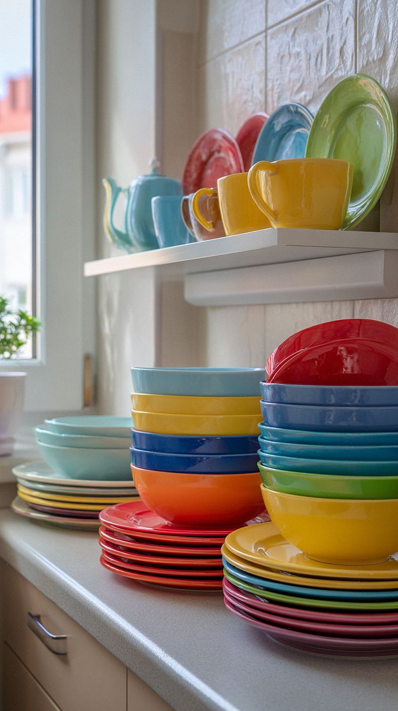
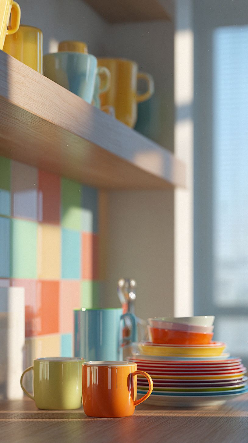
Styling with Accessories, Textiles, and Greenery
Pick a couple of accent colors from your cabinets or backsplash and repeat them in accessories so the room reads as intentional rather than chaotic. Swap in textured tea towels, a woven runner, or patterned seat cushions to soften bright finishes; keep patterns large-scale and colors limited so they feel bold but balanced.
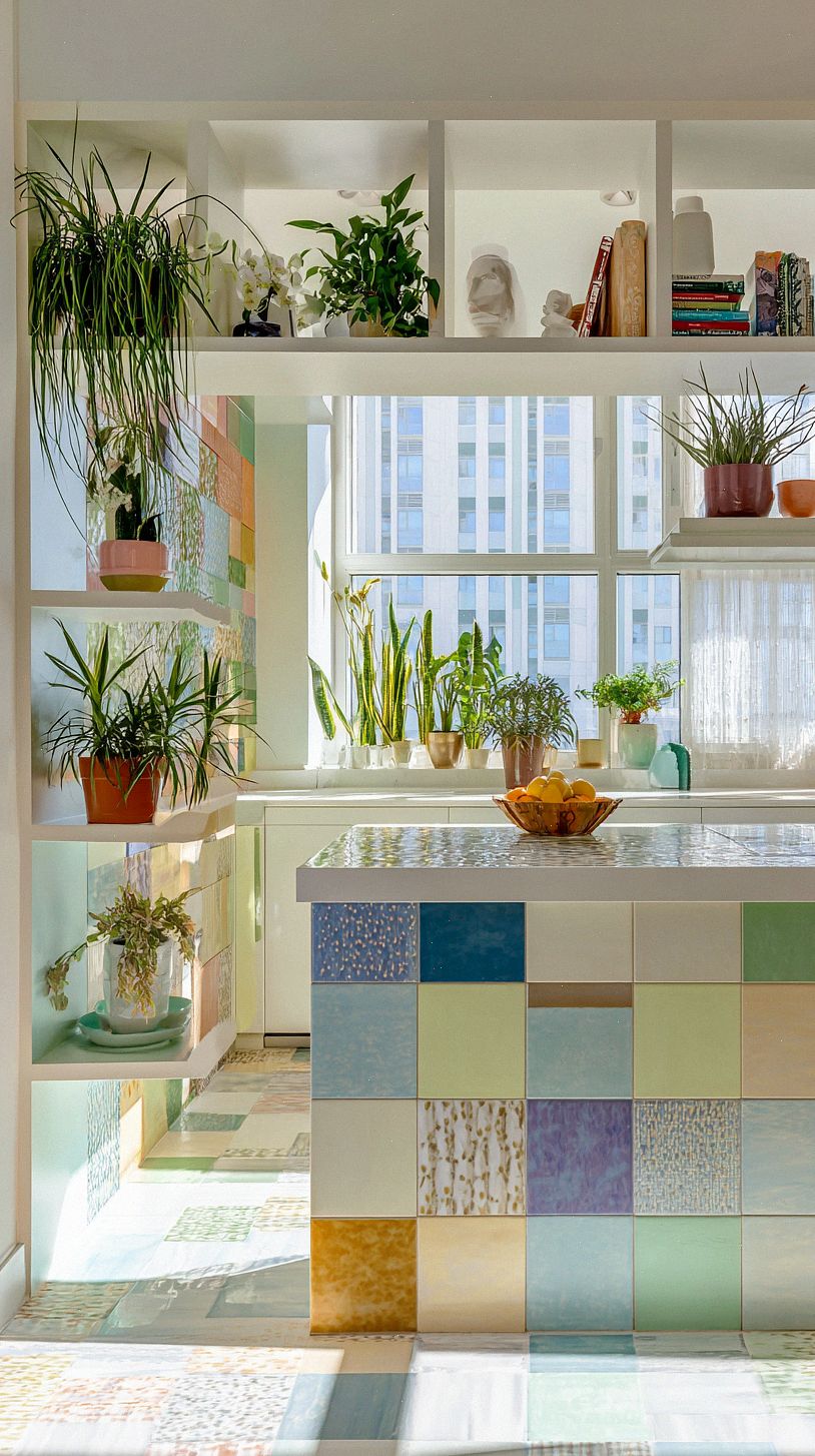
Bring in greenery to break up saturated surfaces and add instant freshness: a windowsill of herbs, a trailing pothos above open shelves, or a statement fiddle leaf fig in a corner will temper strong hues and add life. Choose planters in natural clay, rattan, or matte ceramics to introduce warm, grounding textures that help your colorful choices feel cohesive.
Balancing Functionality: Layout, Flow, and Durability
Think about how you move when you cook and let that shape your layout: place prep, cooking, and cleanup zones so you can work without crossing paths, keep clear walkways to avoid broom-traffic, and use contrasting cabinet colors or a bright island to visually anchor each zone. Keep storage where you need it most, use open shelving for display and closed cabinets for messy tasks, and make sure lighting and sightlines support both function and your bold color choices.
Choose materials that stand up to life in a busy kitchen while complementing your palette, like quartz or porcelain countertops, porcelain or luxury vinyl floors, and glazed tile backsplashes that wipe clean. Pick cabinet finishes and paints rated for kitchens, durable hardware, and protective sealants so your bright hues stay fresh, and use washable textiles or easily swapped rugs to add color without sacrificing longevity.